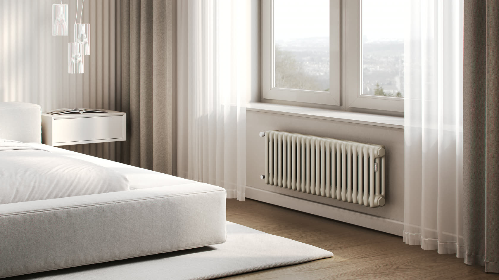
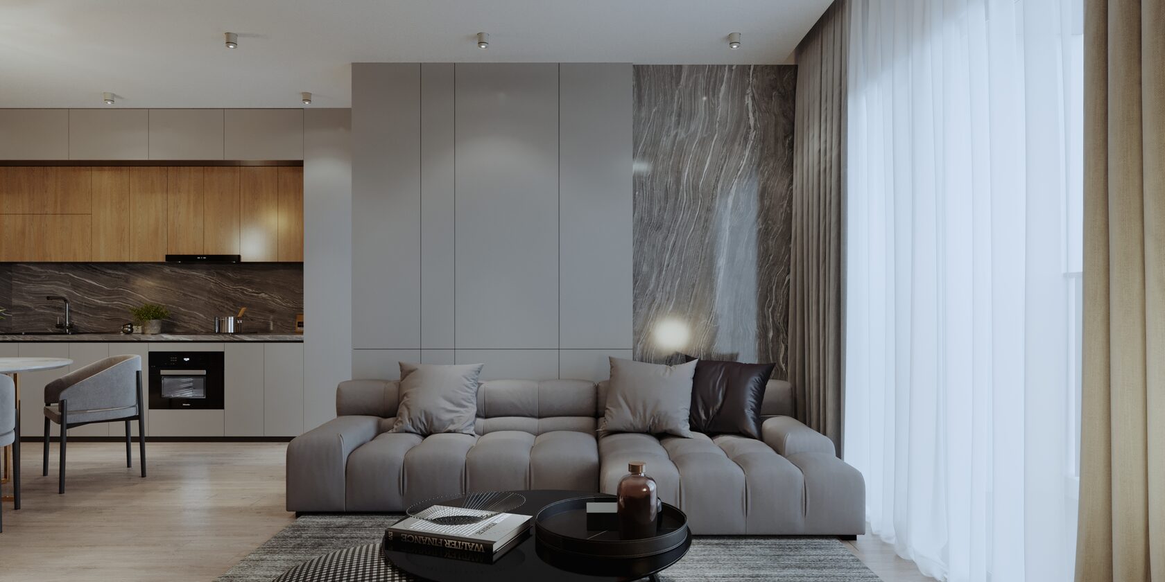
A buyer compares the render with the product they receive. If the shade is off or the gloss turns out matte, that's a return and a bad review. Color and material are the easiest things to get wrong at the brief stage: everyone pictures "metallic gray" differently.
Why a photo is no reference for color
A phone camera adjusts white balance and exposure to the light around it. By a window in daytime, under a lamp in the evening and with flash, the same product comes out in three different shades. The screen the photo is viewed on adds one more distortion.
Photos are useful for something else: they show where each color and material goes on the product. The shade itself comes from a code or a sample.
Which codes to send
- RAL: a color catalog for paints and powder coatings, most common for metal, equipment, radiators and facades. Given as a number, for example RAL 9016.
- Pantone: for plastics, textiles and print. Print colors have separate guides for coated and uncoated paper (C and U) — say which one.
- NCS: a shade system used by interior paint makers, common for furniture and finishes.
- A physical sample: a paint chip, a piece of plastic, a fabric swatch. The most reliable option: you can put it next to the monitor and compare.
Gloss is part of the color
Two finishes in the same RAL look different if one is matte and the other glossy: gloss reflects the surroundings, matte scatters the light. State the gloss level — matte, satin or gloss — and if the finish specification lists it, send the specification.
Texture and material
- Metal: brushed, polished, anodized, powder-coated — in 3D these are four different materials.
- Plastic: smooth or textured, with a fine relief on the surface.
- Wood and veneer: species and tone; photos of the face and the edge help most.
- Fabric: composition and weave. A swatch in hand beats any photo.
If you have a sample but can't ship it, photograph it so the shots are usable:
- For color: from above, in soft daylight, next to a sheet of white paper. The paper shows how much the camera shifted the color, and that can be corrected for.
- For texture: light low from the side. The relief then casts shadows, and the grain, weave or brushing shows in the photo.
How many color variants
If the product comes in several colors or upholsteries, say so at the very start. The model is then set up so color is switched rather than redrawn, and all variants come out with the same light and angle. How to put this into a brief is covered in How to brief a 3D artist.
How to check color on the render
- Compare with the sample in daylight, not from memory and not against a phone photo.
- Look on a regular monitor, not just one phone. Screens show color differently, and "exactly like real life" on every device at once doesn't exist. What matters is that the render matches the sample on a normal screen.
- Account for the scene's light. In warm interior light, white won't be pure white, and that's fine. The color reference is the catalog render on a neutral background.
What it looks like in practice
- KERMI: radiators in RAL colors and in white — 15 models and more than fifty catalog renders.
- Kiparis: some furniture models are shown in 6–8 upholstery variants, all with the same light and angle.
- Velesgard: over several rounds of edits the materials were changed to metal instead of "plastic" — material turned out to matter as much as color.
Common mistakes
- Describing color in words or sending a screenshot from a website.
- Giving a RAL code but saying nothing about gloss.
- Checking the render against a phone photo of the product.
- Sending the fabric swatch after everything has been rendered.
Checklist
- A color code — RAL, Pantone or NCS — or a physical sample.
- The gloss level.
- The material and texture of every visible part, with close-ups in side light.
- For fabric and veneer, a sample in hand.
- A list of all color variants from the start.
- Checking the final render against the sample in daylight.